|
At the beginning of this process, I thought that I would like to do a sort of "Nature Journal" design, as I described in my last post. My own font, ivory paper, etc, etc. Although I had done some sketches, it was only recently I started organizing how sketches might lay on a page, sizing, etc. The first step was designing a font. My handwriting (as can be seen from some of my notes), is almost cursive-like, and sometimes heavily slanted. I used Calligraphr to digitize my handwriting, and I found that that sort of writing (connected/slanted) cannot be uploaded in any recognizable form. Eventually I created the font in photoshop by digitally drawing the letters, but it was surprisingly difficult to do so. It produced a acceptable font, although I probably will continue to work on it -- body text versions, headers, and so on and so on. It was fun, in a way, The next step was trying to step up a sample layout on Photoshop -- designing how I might import fonts and text, how sketches would have to be uploaded and designed, and what stylistic aspects I would want to include. That resulted in this: (Its surprisingly blurry uploaded as a JPEG...I will have to look into that so that files of it don't print blurry) 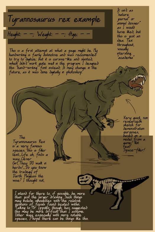 It had much less of a informal design as I had hoped, and the colors are a not quite what I had imagined, but I think it is a solid first draft, or design idea. It wasn't actually the first, but the first that I "finished" with placeholders. The "handwriting" font makes it difficult to do a full naturalist feel without it seeming too much like a video-games' (ARK), but I am going to continue to try. The Title Font, looking a this again, is going to be getting its own edited font, but for the body I think it works well.
The overall color scheme, I think, will remain these shades of browns. It gives it a prehistoric feel. Not every page will be quite so dark, or have that background box, but as I said, we shall see. As time goes on, I think it will be more and more professional looking (experience will help). The size of the page is currently 6 in x 9 in, which is a standard size for some books, but I worry it might be too small. The basic design is here, and didn't take long at all -- I can always adjust for larger page sizes. The real T-Rex page will be double this size wide, taking up too pages, because it deserves more attention. The first real art of the project!
0 Comments
|
AuthorJulia Youssef Archives
April 2021
Categories |
 RSS Feed
